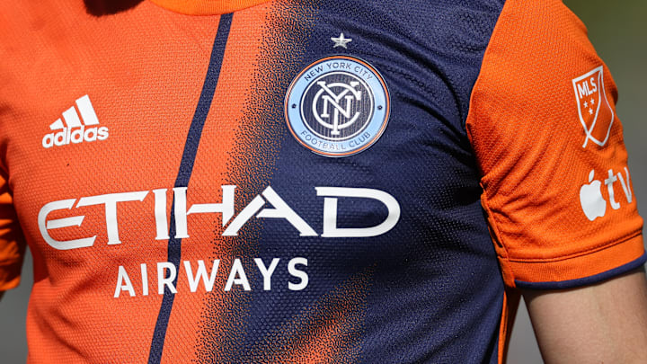
On Wednesday, New York City FC released a third kit for the first time in the club’s history. The new kit, the Parks kit, is very green and honors the city parks. The parks, especially Central Park, are vital parts of city life and act as escapes from the hustle to bustle. It is also a tribute to “their history and the vital role they play for New Yorkers and the beautiful game."
As such, this was an interesting and great decision by the club. The new kit looks nice and is unique. One would not associate NYCFC with green, but most third kits do not match the color scheme of clubs. The green relates to the city parks and, in some way, is a nice tribute. It shows that the club remembers the city is not just concrete and skyscrapers; it is much more than that.
The NYCFC third kit is a wonderful tribute to the parks
Looking at the new NYCFC shirt, the multiple shades of green create an exciting look. It is not one shade, which would have been a bad look for a third kit. Rather, the mix of greens creates a plant-like look without putting plants on the shirt. From the club’s perspective, it is the “layering of different textures of Central Park."
Also, it expresses variety. Throughout the city parks, there are numerous trees and plants. The variety within the parks allows for life to flourish. It also leads to differences between the parks and within. That is why NYCFC used “the foliage, roots, rock outcroppings and grassy lawns” from Central Park on the front of the shirt.
It reflects the city as a whole too. New York City is a melting pot full of different cultures. The differences in the kit act as a reminder of the people within the city and how one can find the different cultures throughout the parks.
From Coney Island Beach to Central Park. From community gardens to Greenstreets. @NYCParks are our common ground 🏞 #ForTheCity
— New York City Football Club (@NYCFC) August 16, 2023
🔗 https://t.co/Wg7oFJkdtf
Of course, this kit is due to a partnership with the New York City Parks. Hence, the logo is on the front of the shirt. It acts as a thank you to every single person in the parks’ system that works to allow some greenery in the concrete jungle.
If there is one clear negative, then it is the fact the back of the kit is a solid green. It would have been extremely unique to have plant-like patterns throughout the entire shirt. The names and numbers on the back would have popped.
In the end, New York City FC did well with the design of the Parks Kit. The real test will be how it looks on the grass at Citi Field and Yankee Stadium. If it looks good from the stands, then will be a golazo of a home run third kit.
