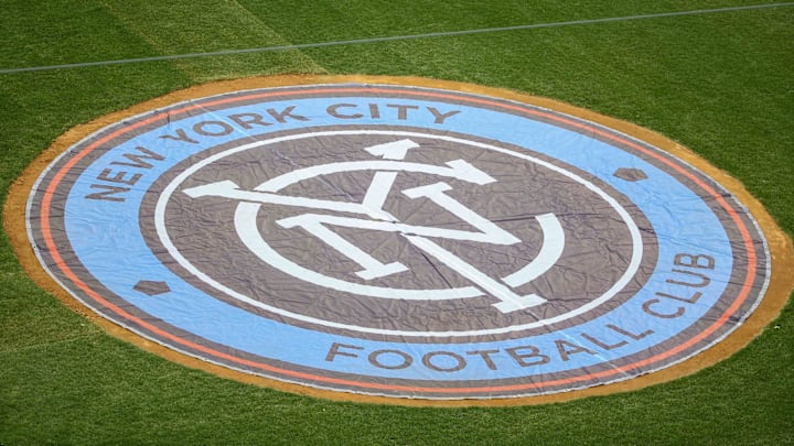
New York City FC has been slightly revamping the club's brand this year. First, the team is focusing on using New York City FC over NYCFC, despite the fact many fans still use NYCFC. The club also increased the colors that will be associated with the team while still predominantly utilizing sky blue, orange, white, and dark blue.
A brand refresh is never the worst thing, and it makes sense as the Pigeons start the countdown to moving into their new home in 2027. The excitement continues to build, and more changes with the club were expected.
However, the one item that did not need to be changed was NYCFC's badge. Arguably, it is one of the better ones in Major League Soccer. Yet, the team decided to change that as well.
NYCFC's new badge is just okay
On Monday, NYCFC announced the new badge that will take over in 2025. It is very similar to the original, as seen in the cover photo. The new badge can be seen below.
Past. Present. Future. pic.twitter.com/ie9frNdvfI
— New York City FC (@newyorkcityfc) September 9, 2024
As one can see, it is similar. Some of the borders were removed and it still says New York City FC. The font and logo itself are bigger, with the font being different.
For those who are not fans of the club, they might not have noticed the differences right away. However, they are there, subsequently leading to the new badge. It is nice that NYCFC is sticking with what they know, but the changes make the new badge just okay. There is nothing special or any wow factor.
Truthfully, the original badge is better. The new one looks like the Pigeons made the badge just to make a change. Again, it is okay, but there is nothing special about it. There is no reason to be tremendously upset about it either, as some fans are. Understandably, everyone will have a different opinion.
Still, the new badge was unnecessary and was not what supporters wanted. They want changes to the club where NYCFC goes out and brings the better players to the team. They want a front office that will be truthful and a head coach that is actually successful. Nick Cushing might have done enough to keep his job for the season, but whether he is the right fit still remains a question.
Right now, the product on the pitch is more important than what is done off the pitch. Perhaps it would have been better for NYCFC to adjust the badge and logo in 2026 or 2027. It is known they received feedback from fans, but maybe the team should let everyone help design the badge in the future. Changes should be for the better. As the saying goes, things should not be fixed if they are not broken, and this includes NYCFC's badge.
